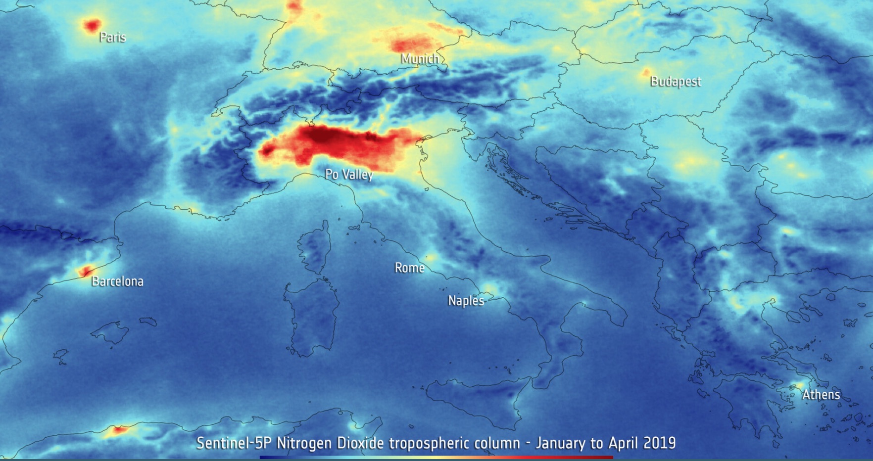
This post is inspired by maps showing how the distribution of the Nitrogen Dioxide gas (\(NO_2\)) decreased following the Covid-19 pandemic. The image below is from the ESA Sentinel-5p satellite. \(NO_2\) is a gas created during combustion of fossil fuel. The less cars and factories are active, the less \(NO_2\) is expected to be injected into the earth atmosphere.
I decided to visualise the \(NO_2\) distribution using NASA satellite data and python's usual suspects (numpy, pandas and geopandas). This is surprisingly easy. Satellite data are often images: matrixes of floats. Hence, they can be manipulated using numpy. The objective is to make the map visually appealing, while being scientifically accurate. But I will not be talking about the science behind the observations because I am not an expert in the field.
Data
I am using \(NO_2\) data from the NASA OMI satellite. Although they are much lower resolution than the Sentinel-5p satellite used in the picture above, they are also much smaller (only 10 Megabytes for one day), pre-processed and easier to handle. The resolution of 0.25x0.25 degrees is good enough for this exercise.
I downloaded one month worth of data (April 2019) from the NASA website.
One day of data contains, among other things, a matrix of 1440x720 pixels. Each pixel represents the cloud-screened tropospheric column of \(NO_2\) expressed as molecules/\(cm^2\). Cloud-screened means that observations with too many clouds were discarded. Tropospheric column means we are counting molecules per \(cm^2\) in the troposphere, which is the lowest level of the atmosphere. The troposphere stops at around 13km from sea-level, about the cruise altitude of commercial planes. For those not familiar with the scale of the problem, we are dealing with an average of \(10^{15}\) or 1 quadrillion molecules/\(cm^2\).
import numpy as np
import h5py
import glob
import geopandas as gpd
import pandas as pd
from shapely.geometry import Polygon
from matplotlib.pylab import plt

world = gpd.read_file(gpd.datasets.get_path('naturalearth_lowres'))
Our dataset is made of 30 files: the number of days in April.
files = glob.glob('data/2019/*')
print(files[0:3])

['data/2019/OMI-Aura_L3-OMNO2d_2019m0417_v003-2019m1123t104313.he5',
 'data/2019/OMI-Aura_L3-OMNO2d_2019m0428_v003-2019m1123t105110.he5',
 'data/2019/OMI-Aura_L3-OMNO2d_2019m0404_v003-2019m1123t103918.he5']
Each file is saved in he5 format. You can think of a he5 file as a non human-readable json file with key-value pairs. The keys and values contain information about the observations (date, cloud coverage, data quality, etc.), the raw data (as a numpy array) and the processed data (as a numpy array). I am using the h5py module to read he5 files with python.
Analysis
Plotting only one day of data will result in a noisy map, with a patchy \(NO_2\) distribution due to clouds and other factors. Let's write a function which stacks all the daily observations on top of each other and takes the logarithm of the average density in each pixel. The result is a matrix with the same shape as the daily matrix, but with much more signal compared to a daily observation.
FILL_VALUE = -1.2676506e+30

def monthly_no2(files, filter_to_nan = 14.5):
    """
    Return monthly averaged $NO_2$ matrix from a list of files
    """
    arr = np.empty((len(files), lat.shape[0], lon.shape[0]), dtype=float)
    p = 'ColumnAmountNO2TropCloudScreened'
    for ix, file in enumerate(files):
        with h5py.File(file, 'r') as f:
            data = f['HDFEOS']['GRIDS']['ColumnAmountNO2']['Data Fields'][p][:]
            data[(data == FILL_VALUE) | (data <= 0)] = np.nan
            arr[ix] = data

    average_monthly = np.log10(np.nanmean(arr, axis = 0))
    average_monthly[average_monthly < filter_to_nan] = np.nan
    return average_monthly
And we can already compute our monthly \(NO_2\) distribution.
average_monthly = monthly_no2(files)
Let's start making some maps. We don't want to see country boundaries, so let's get rid of them.
continents = world.dissolve(by='continent')
continents = continents[~continents.index.isin(['Seven seas (open ocean)', 'Antarctica'])]
continents = continents.geometry.explode().reset_index()
Let's plot the \(NO_2\) density average_monthly we just calculated.
PIXEL_SIZE = 0.25
lon = np.arange(-180, 180, PIXEL_SIZE)
lat = np.arange(-90, 90, PIXEL_SIZE)

fig, ax = plt.subplots(1, figsize=(16,10))
ax.pcolormesh(lon, lat, average_monthly, cmap='cividis',
              vmin=vmin, vmax=vmax)
continents.boundary.plot(ax=ax, color='black')

ax.set_xlim(-180,180)
ax.set_ylim(-60, 85)
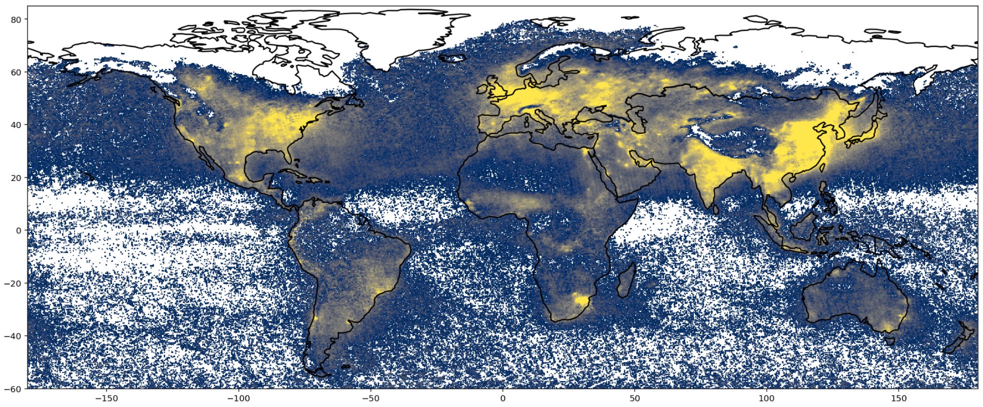
Yellow means more \(NO_2\) and blue means less \(NO_2\). This is nice, but a bit messy. Continents cannot be seen clearly and the weak \(NO_2\) distribution on the oceans makes the plot a bit hard to read. To fix it, we are going to plot \(NO2\) density above continents only and mask the rest. The trick is to create an inverted version of our continents dataframe (such that we have void in correspondence of the continents), and overlay this inverted map on top of our \(NO_2\) distribution map. This will mask the oceans, and show continents only.
# Make the inverted map
edges = Polygon([(-180, -90), (180, -90), (180, 90), (-180, 90)])
world_edges = pd.DataFrame({'geometry': [edges], 'name': ['world']})
world_edges = gpd.GeoDataFrame(world_edges, geometry='geometry')
inverted_map = gpd.overlay(continents, world_edges, how='symmetric_difference')

# Plot it
fig, ax = plt.subplots(1, figsize = (16,10))
ax.pcolormesh(lon, lat, average_monthly, cmap='cividis',
              vmin=vmin, vmax=vmax)

inverted_map.plot(ax=ax, color='white', zorder=1)
inverted_map.boundary.plot(ax=ax, color='black', lw=0.5, zorder=1)

ax.set_xlim(-180,180)
ax.set_ylim(-60, 85)
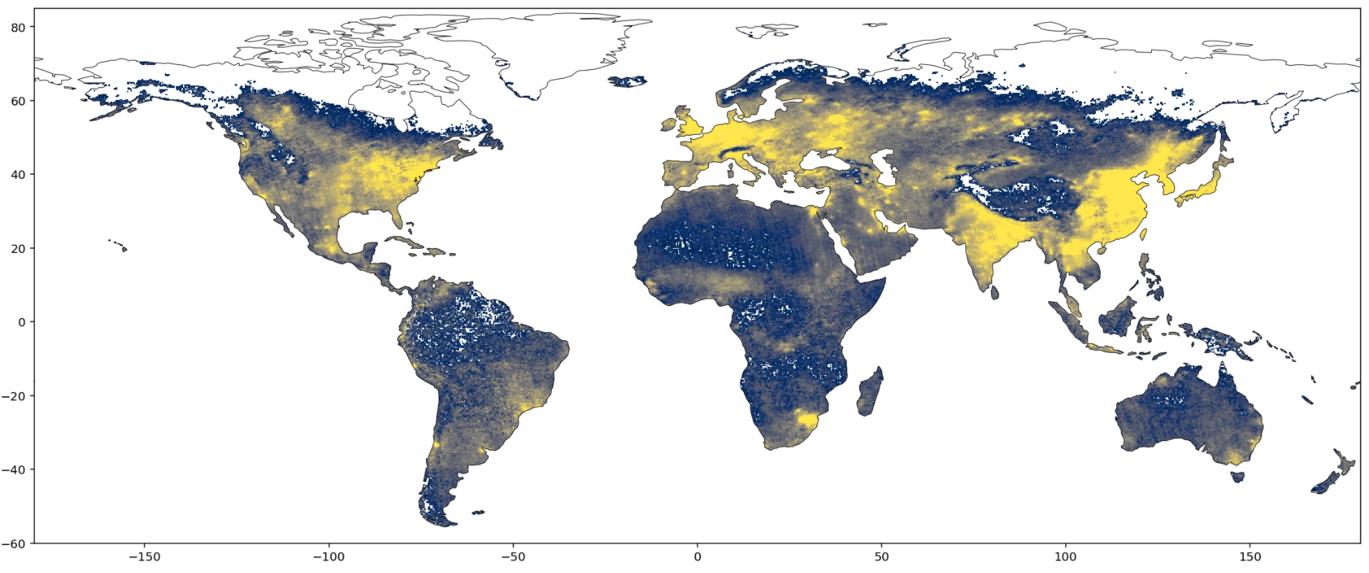
And here we have it. This map is much easier to read because the eye goes straight to the continents. You can clearly see that there is more \(NO_2\) around commercial hubs and metropolis. You can even see the Himalayas shielding the \(NO_2\) coming from India and China!